Graphic design geeks spot subtle flaws in HBO’s corporate logo
Netflix, Disney+, Prime Video and other platforms have turned their logo-themed intros into a hallmark, although you'll never see HBO's in the same way again.
Streaming platforms have turned their opening stingers into powerful branding tools. From Netflix’s iconic “tudum” to Prime Video’s soft glow, Apple TV+’s sleek intro, and HBO’s unmistakable tuning‑style sound, these logos have become part of the viewing ritual.
But while some companies obsess over every pixel, others let small imperfections slip through—details most viewers never notice, but that drive visually sensitive people up the wall.
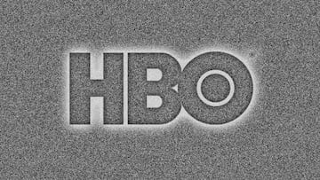
And HBO, surprisingly, is one of the biggest offenders. Once you see the flaws in its logo, you won’t be able to unsee them the next time you fire up The Last of Us, House of the Dragon, or Peacemaker.
HBO’s logo has alignment issues—and they’re hard to ignore
It’s unclear whether HBO’s quirks are intentional or simply a relic of older design practices, but the logo used across the Warner Bros. streaming ecosystem is full of subtle misalignments. Pause the screen and look closely: something feels off. Zoom in and the problems become obvious.
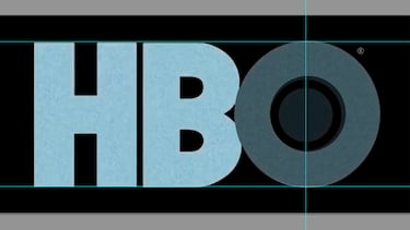
If you drop alignment guides in any image‑editing program, you’ll notice:
- The “B” sits slightly lower than the “H.”
- The big “O” sits higher than both letters.
In other words, none of the three characters line up. For graphic designers—or anyone with even mild OCD tendencies—it’s a nightmare. The letters in “HBO” simply don’t align with each other at all.
And there’s more. Look closely at the “O”:
- The double‑ring center isn’t perfectly centered.
- It’s shifted slightly to the left, creating an off‑balance look once you notice it.
Given how many blockbuster series carry this logo, it’s surprising HBO hasn’t updated it.
Why the HBO logo looks this way
There’s actually a reason behind these imperfections: the HBO logo is old—really old—and it was created long before the digital design era. It was originally drawn by hand, which naturally introduced small inconsistencies that modern tools make glaringly obvious.
Another fun detail: while the width proportions are mostly consistent, the “O” is noticeably wider than the “H” and “B.” In fact:
- The “H” and “B” share the same width.
- Multiply that width by 1.25, add the spacing, and you get the exact width of the “O.”
It’s a reminder that even the most iconic logos can carry the fingerprints of the era in which they were created.
Related stories
Get your game on! Whether you’re into NFL touchdowns, NBA buzzer-beaters, world-class soccer goals, or MLB home runs, our app has it all.
Dive into live coverage, expert insights, breaking news, exclusive videos, and more – plus, stay updated on the latest in current affairs and entertainment. Download now for all-access coverage, right at your fingertips – anytime, anywhere.
Complete your personal details to comment