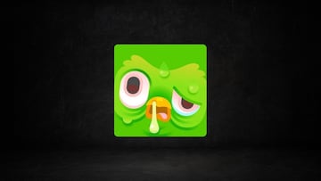
Why does my Duolingo icon look sick? Is there something wrong with the app?
Have you noticed your Duolingo icon looks weirdly sick? You’re not the only one! Here’s the reason why it happened.

If there are any absolute truths in the world, it’s the idea that the earth rotates around the sun, that fire burns, that you need food to live, and that Duolingo will always find out when you’ve missed your daily lesson. And to remind you of the last one, Duo the Owl has many ways to let you know you’re in danger of doing so. Except this latest one may have freaked out some users accidentally.
Recently, several users of the language learning app have reported seeing the software’s icon turn into a hideously deformed version of the green owl’s face. Upon closer inspection, the creature seems to only be extremely sick, but why did Duolingo do this to their mascot? Well, there’s nothing to worry about, as it’s par for the course for the app to do stuff like this.

What happened to Duo in the icon?
Certain users may find that Duo is looking very much under the weather when looking at their Duolingo app, and the reason for that is just what one would expect from the app: It’s a way of catching your attention so you remember to take your daily lesson.
The sick version of the mascot looks like that because you haven’t entered the app during that day, and time is running out for you to continue your lesson streak. To fix it you simply need to go into the app and take a quick lesson. After that you’ll find that the owl is healthy once again, and that the icon has gone back to its usual self.
Why did Duolingo add a sick-looking icon?
This kind of playful update is nothing new to Duolingo, which from its beginnings has leaned on tactics like this to grab users’ attention. Those who have used Duolingo in the past few years know that the app constantly changes its icon to represent different things, from being on fire to show you’ve got a long streak of successful lessons under the belt, to melting and desperate expressions on the owl’s face to urge you into taking one.
Related stories
The tactic clearly works too, as it leads to more people clicking on it to see what is wrong with the mascot, or at the very list looking to find out what other surprises there are in the app. So don’t worry too much about how the icon looks. If you don’t like how it looks (as the icon seems to be stuck for some users), you can always choose to use one of the “Streak Society” icons you get as a reward for completing certain streaks instead of the regular icon. Otherwise, if you have Super Duolingo, you can change it to one of its premium icons.
Follow MeriStation USA on X (formerly known as Twitter). Your video game and entertainment website for all the news, updates, and breaking news from the world of video games, movies, series, manga, and anime. Previews, reviews, interviews, trailers, gameplay, podcasts and more. Follow us now!


Complete your personal details to comment