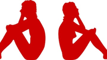
Kappa change logo to support social distancing message
The famous sports brand has a campaign in which to raise money to help in the fight against coronavirus, and are separating their two shirt symbols.

Kappa has made a significant change to its historic logo. The famous Italian sports brand, which is seen on the football shirts of the like of Real Betis and Napoli, has launched a series of shirts in which the man and woman who form its commercial symbol now appear separate from each other.
Logo distancing from Kappa
This campaign is part of a solidarity initiative to support the groups that have been most affected during the coronavirus health crisis in Spain. The money raised from the products sold will help to buy medical supplies for hospitals, residences and non-profit associations.

Related stories
Kappa, who last February celebrated the 20th anniversary of their most revolutionary shirt, the Kombat, wants to make a splash with the release of this new line of shirts. One is black and the other is white, but both have only half the logo visible on the chest. On the white clothing, only the female half is seen sitting, while on the black version only the male half is seen. In both garments the other half is alluded to but it is not seen as clearly.
With this new logo, Kappa wants to symbolise the importance of social distancing, a measure that can save thousands of lives.
