Cracker Barrel is the latest example: these companies failed with the new design of their logo
When brands mess with beloved logos, the backlash can be swift, costly, and occasionally hilarious.

Given how product design has shifted in recent years, you’d be forgiven for thinking that a clean, simpler logo would work better on consumers in 2025 than a traditional one with a sketch of a man in overalls leaning on a barrel. It’s what Cracker Barrel thought too, only to see their stock price tank.
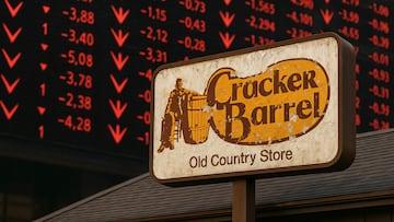
Indeed, the company’s decision to retire ‘Uncle Herschel’ in favor of a stripped-down wordmark wiped nearly $100 million in market value in a single day. Ouch!
Key points from this article:
- Cracker Barrel’s redesign erased its folksy mascot and spooked investors.
- Shares plunged 7.2% on the day of the reveal, erasing about $94 million.
- Fans called the new design “generic” and “woke,” while experts labeled it a fiasco.
- History shows other brands have paid dearly for logo missteps, but some got it right.
Why did Cracker Barrel change its logo?
As you may have already guessed, the company said the new design keeps the iconic barrel but aims for a modern, simplified look. CEO Julie Felss Masino has been steering Cracker Barrel away from its 55-year “old-timey” aesthetic, with updated menus and store interiors meant to attract younger diners.
NEW: Cracker Barrel reveals new logo, CEO Julie Felss Masino says people love their new rebrand.
— Collin Rugg (@CollinRugg) August 20, 2025
"Honestly, the feedback's been overwhelmingly positive that people like what we're doing," Masino told GMA while discussing the overall rebrand.
This logo is depressing. pic.twitter.com/EZVpWLv4Bg
But the market didn’t buy it. Shares fell from $59 to as low as $50 before stabilizing around $54. Critics argued that the brand had something customers deeply identified with, and by scrapping it, the company risked alienation.
What other logo redesigns have bombed?
Cracker Barrel joins a long line of branding casualties:
- Gap (2010): The clothing retailer swapped its blue square for a minimalist Helvetica wordmark with a tiny gradient box. The internet mocked it mercilessly. Within a week, Gap reverted to the old logo.
- Tropicana (2009): The juice brand ditched its orange-with-straw logo for a sterile glass design. Sales dropped by 20% in two months, costing parent company PepsiCo an estimated $30 million before they brought the orange back.
- Olive Garden (2014): Grapes disappeared, the rustic lettering softened, and the restaurant chain was accused of looking like “a student project.” Sales didn’t see the revival the rebrand promised.
- Kraft (2009): A fireworks-burst logo full of colors, fonts, and swooshes was so widely panned it lasted barely five months before being replaced.
- American Airlines (2013): The classic “AA” with the eagle wings was swapped for an abstract flag design. Critics blasted it as bland and irrelevant, noting that the airline’s operational struggles overshadowed any cosmetic fixes.
- “We ❤️ NYC” (2023): A modern take on Milton Glaser’s iconic “I ❤️ NY” was meant to inspire civic pride. Instead, it was mocked as corporate and cold, lacking the warmth of the original.
- Mazda (2024): The automaker went flat and ultra-minimal. Fans called it “boring,” saying it stripped away the brand’s personality.
And remember, behind most changes is a supremely confident marketing design team getting paid a small fortune.
When logo changes are a success
So, obviously changing your company’s look can be good for business, but often the trick is subtlety. Here are some examples of redesigns that modernize without discarding heritage:
- Apple: From a hyper-detailed Newton under a tree to the iconic bitten apple. Each simplification brought clarity while keeping the symbol instantly recognizable.
- Starbucks: The siren gradually zoomed out of her ring, becoming cleaner while retaining her mythic presence.
- Google: Tweaks over time kept the playful colors but refined the font for digital readability.
- Instagram (2013 update): A sharpened script logo improved legibility without altering its character.
- Pepsi (2025 refresh): A return to retro roots with a bolder wave and black lettering – modern yet familiar. Fans and designers widely praised it.
Should companies ever change their logo?
As someone who has worked in the creative industry, specifically advising on this, I am acutely aware of the value of packaging and logo design. It can, if done right, grab the desired impact and shareholders can reap the rewards.
But, as Cracker Barrel has seen first hand, it can also erase what people love about a brand.
Related stories
Get your game on! Whether you’re into NFL touchdowns, NBA buzzer-beaters, world-class soccer goals, or MLB home runs, our app has it all.
Dive into live coverage, expert insights, breaking news, exclusive videos, and more – plus, stay updated on the latest in current affairs and entertainment. Download now for all-access coverage, right at your fingertips – anytime, anywhere.
Complete your personal details to comment