A new Persona 6 leak seems to confirm the game’s color theme was sneakily revealed years ago
An Atlus insider has revealed the color theme chosen for the next game in the Persona series, Persona 6, which was seemingly revealed years ago already.


Almost 8 years ago we witnessed the release of Persona 5, the installment that marked the leap of the franchise to the forefront of Atlus’ JRPG portfolio internationally. Although the next stop of the studio is Metaphor: ReFantazio, many rumors have risen around Persona 6. Now a known insider of the franchise that goes by Midori has leaked what the main color of the next installment will be: green.
The color theme for Persona 6 is green.
— みどり (@MbKKssTBhz5) April 8, 2024
But it’s not just any green. Specifically, Midori points out that the tone used is “lime green” with code #2FC245. Why so much detail? Well, because apparently it was Atlus itself that already announced the news 3 years ago without anyone realizing it.
Development began in 2019 along with P3R and P5T.
— みどり (@MbKKssTBhz5) April 8, 2024
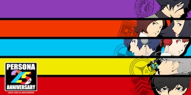
In 2022, during the franchise’s 25th anniversary celebration, a multitude of promotional images were published with all the protagonists reunited. One in particular stood out above the rest. The seven characters appeared in front of graffiti that used all the main colors of the identity of each installment. Next to the last one, Joker, a bucket of green paint appeared, suggesting that there was still something left to paint. As is evident, this color is not linked to any game in the series at the moment. Midori’s information seems to connect the missing dots in this puzzle.
This is the shade of green that is used in P6.
— みどり (@MbKKssTBhz5) April 8, 2024
Why is it so important to know the color of a Persona title?
It may seem like a trivial notice. It is not usual for the color used around a franchise within the video game to be newsworthy. However, for the Persona brand, it is more than a letter of introduction: It is a declaration of intent that will be reflected directly in the game’s experience.
Related stories


The predominant color paints interfaces, menus and the way the player perceives the world. For example, in Persona 5 the tone used is red, which permeates the personality of the Phantom Thieves and gives color ( never better said) to the danger they undergo when facing these dark personalities within society. In short, it is linked to the journey full of dangers they undergo.
In Persona 4 it was yellow; in Persona 3, on the other hand, blue predominated except in the female protagonist’s route of the Portable edition, which opted for pink; in Persona 2 it was orange; and finally Persona, or rather, Shin Megami Tensei Revelations: Persona, which marked the beginning of the franchise in a perfect purple. The meanings are deep in each delivery and associated with the plot context that its protagonists face.
Complete your personal details to comment