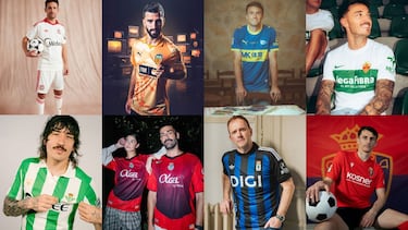
Elche CF@elchecfThe shirt is inspired by the 1991–92 season, a special chapter in the club’s history that marked a significant sporting period. That year is remembered for the 4–1 victory over Hércules and qualification for the promotion playoffs after finishing fourth, as well as the standout roles of players such as Boria, Búfalo Crespín, Jesús de Huerta, Murúa, and Puche, with Miguel in goal and Bertomeu Llompart on the bench.
The design brings back hallmark elements of the era, such as the higher, narrower stripe and the crest featuring the “F.C.” designation, reinterpreted with a modern touch to honor the club’s roots.
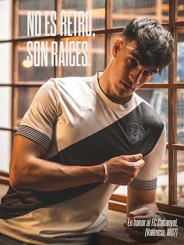
Levante UD@levanteudThe shirt is inspired by the origins of Levante UD, founded in 1907 under the name Fútbol Club Cabanyal, a formative period that shaped the club’s first footballing identity. This tribute highlights its historical roots and the legacy that gave rise to the present-day institution.
The design brings back characteristic elements of that era, such as the black diagonal sash over an off-white base and the monochrome crest, reinterpreted with a modern touch to strengthen the link between past and present.
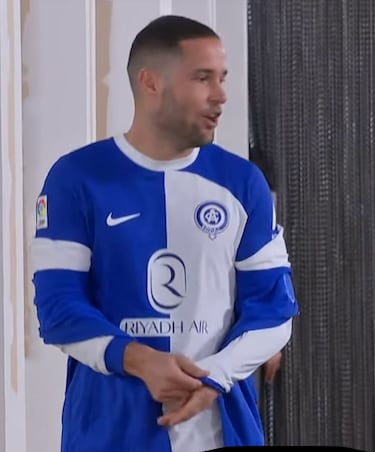
Atlético MadridRedes Sociales The shirt is inspired by the origins of Club Atlético de Madrid, founded in 1903 under the name Athletic Club, and its early years in blue and white. That formative period marked the birth of the club and is tied to its first games at the Campo del Retiro, as well as the pioneering players who laid its foundations.
The design brings back the original blue and white colors, also seen during the club’s 120th anniversary in the 2022/2023 season, when Diego Pablo Simeone’s team wore them at the Riyadh Air Metropolitano, reinterpreted with a modern touch to strengthen the connection between origin, memory, and present.
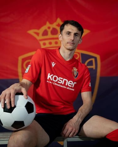
CA Osasuna@caosasunaThe shirt is inspired by the legendary Club Atlético Osasuna side that competed in the late 1970s and early 1980s under Pepe Alzate, a period that culminated in promotion to the First Division after seventeen seasons and consolidation in the top flight with an ultra-attacking style that earned them the nickname “Osasuna of the Indians.”
That generation was defined by the forward trio of José Manuel Echeverría, Enrique Martín, and Patxi Iriguibel, supported by a strong core of Navarrese players and the quality of Clemente Iriarte in midfield.
The design brings back hallmark elements of that era, such as the oversized historic crest, the V-neck collar, and the original color tones, reinterpreted with a modern touch to strengthen the link between memory, the club’s red identity, and the present.
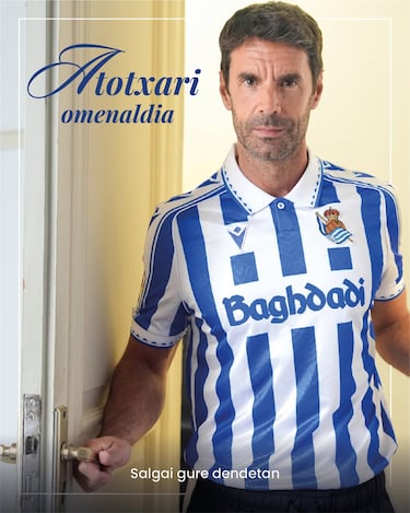
Real Sociedad de Fútbol@realsociedadThe shirt is inspired by the kits worn by Real Sociedad during the final years of the historic Atotxa Stadium, the txuri-urdin home for 80 years, from 1913 to 1993, and the stage for their first major titles. That era is a fundamental part of the club’s identity and the collective memory of its supporters.
The design brings back iconic elements from those years, such as the polo-style collar, jacquard ribbing, and sublimated stripes with a 1990s pattern. It also features the stadium’s silhouette and the dates 1913–1993 on the back, all reinterpreted with a modern touch to strengthen the link between history, identity, and the present.
Related stories
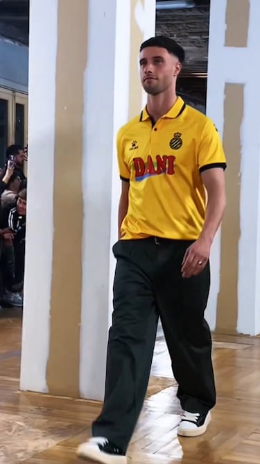
RCD Espanyol de BarcelonaRedes Sociales The shirt is inspired by the origins of RCD Espanyol, founded on October 28, 1900, under the name “Sociedad Española de Foot-ball,” a period in which the club first wore yellow and black. Those early years marked the beginning of a century-long history that still endures today.
The design brings back the essence of that original kit, incorporating a four-leaf clover pattern and a reproduction of the original article on the chest, along with the retro Dani patch from the 1994–95 season, blending tradition and competitive legacy into a single garment.
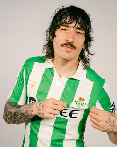
Real Betis Balompié@realbetisbalompieThe shirt is inspired by various elements from the historic kits of Real Betis Balompié, creating a broad tribute that evokes four decades of verdiblanco heritage without replicating a single model.
The design brings together the classic, straight structure of the late 20th century, the standard-width green-and-white stripes typical of the 1960s and 70s, the open V-neck with a slight lapel from the 1980s, and an embroidered version of the crest used in the early 1990s. The result is a garment that connects generations and reinforces the bond between tradition, identity, and the present.
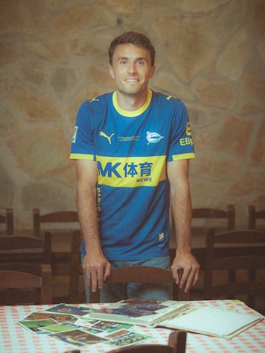
Deportivo Alavés@deportivoalavesThe shirt is inspired by the UEFA Cup final played on May 16, 2001, in Dortmund—the first European final in Deportivo Alavés’ history. That night against Liverpool, marked by the unforgettable 4–4 before extra time, defined the team’s character: brave, ambitious, and competitive until the very last minute.
Twenty-five years later, the commemorative design turns that milestone into a lasting legacy—not as a nostalgic memory, but as a symbol of identity and belonging that projects the club into the future.
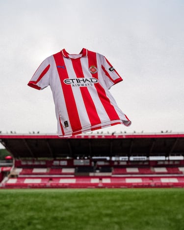
Girona FC@gironafcThe shirt is inspired by Girona FC’s 1991/92 season, a time when the club competed in Segunda División B, far from the spotlight but deeply rooted in its local identity. More than a period of sporting success, it was an era defined by persistence, commitment, and the unwavering loyalty of its supporters.
Under the concept “A past that still plays,” the design pays tribute to those who were there when there were no cameras or guarantees, to those who carried the club forward without knowing how far it would go. The garment connects that past with Girona’s present, reminding us that today’s reality was built on the conviction and support of an entire community.
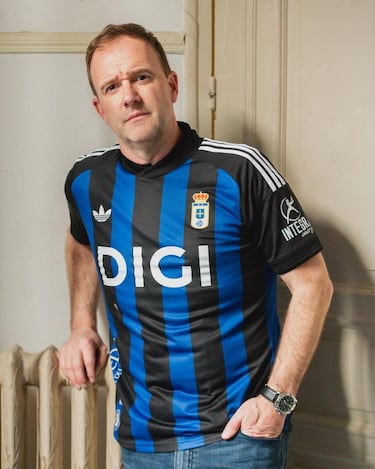
Real Oviedo@realoviedoThe shirt is inspired by the kit unveiled in March 2017 to mark the club’s 91st anniversary. That design combined black, representing the earth, with blue, a symbol of the club’s spirit, creating an identity defined by pride and belonging.
What began as a special edition went on to become a fan favorite, with supporters calling for its return for years. Now, one of the most admired, requested, and fondly remembered shirts by those who have followed the club’s journey is back.
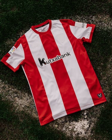
Athletic Club@athleticclubThe shirt is inspired by the kit worn by Athletic Club in the early 1970s, between 1970 and 1975, a key period in the club’s modernization. Those years were marked by milestones such as the restoration of the original name Athletic Club, the opening of the Lezama training facilities, and the 1973 Copa victory against CD Castellón.
The design brings back the red-and-white shirt with a closed collar, black shorts, and the classic socks with horizontal red-and-white stripes, linking that historic moment with the identity that has defined the club over the decades.
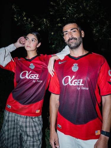
RCD Mallorca@rcdmallorcaoficialThe shirt is inspired by a story set in the early 2000s, a vibrant period for RCD Mallorca when the team stood out for its competitive spirit and the talent of players such as Samuel Eto’o. According to accounts from football circles at the time, several Nike executives took notice of the team after seeing the energy it displayed on the pitch and traveled to the island with the idea of bringing the club under the brand. They even arrived with an exclusive design inspired by the Total 90 line, intended to reflect Mallorca’s identity at that moment.
Although that shirt was never produced, the club now revisits that story to pay tribute to its past and strengthen its connection to Mallorca’s identity and legacy.
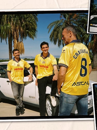
Villarreal CF@villarrealcfThe shirt is inspired by the kits worn by Villarreal CF in the early 21st century, a period when the Yellow Submarine began to establish itself among Spain’s elite and write its first chapters in European competition. Those years marked the emergence of a side known for its attacking football and growing international recognition.
The design brings back the pre-2004 aesthetic, with a strong presence of blue, the club crest and the historic Joma logo embroidered, along with a polo-style collar that enhances the garment’s classic feel. The shirt combines that historical inspiration with modern materials, preserving its retro essence without sacrificing comfort and contemporary textile technology.
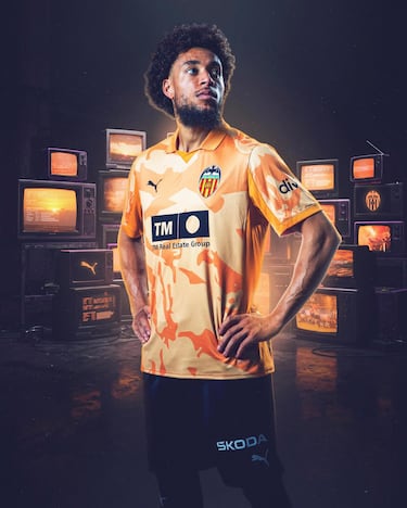
Valencia CF@valenciacfThe shirt is inspired by the alternative kit worn by Valencia CF in the early 1990s, specifically during the 1990/91 and 1991/92 seasons. That design was worn by players such as Ricardo Arias, Fernando Giner, Voro, Paco Camarasa, Fernando Gómez Colomer, Miguel Ángel Bossio, Lubo Penev, Enric Cuxart, Carlos Arroyo, Rommel Fernández, and Robert Fernández.
The garment brings back that model, which helped establish orange as one of the club’s defining colors and later became part of some of its most memorable moments. The design reinterprets the original aesthetic with different shades of orange and a crest inspired by the one used in the early 1990s, linking memory with Valencia’s identity.
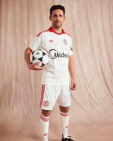
Sevilla FC@sevillafc The shirt is inspired by the classic aesthetic of Sevilla FC’s kits, reinterpreting the traditional home colors through a retro-inspired palette. The classic white shifts toward an off-white tone, while the vibrant red becomes a desaturated, chalk-like shade, enhancing the garment’s vintage character.
The design adopts a minimalist look with a polo-style collar, echoing the kits worn by the club in the 1980s. As a distinctive feature, the shirt incorporates Sevilla FC’s historic crest used from the early 20th century until 1921, replacing the current one to strengthen the connection with the club’s heritage and identity.
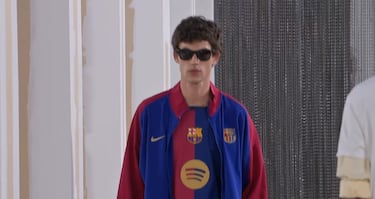
FC BarcelonaRedes SocialesThe design is inspired by the club’s legacy, history, and roots, coinciding with the celebration of its 125th anniversary. Using the blue and garnet colors featured in the crest as the central element, a distinctive, unique, and symbolic design was created to evoke the team’s identity through the years.
To honor the club’s origins, the concept draws from its first kit in 1899: a two-tone shirt with a design that offers an elegant and classic contrast.
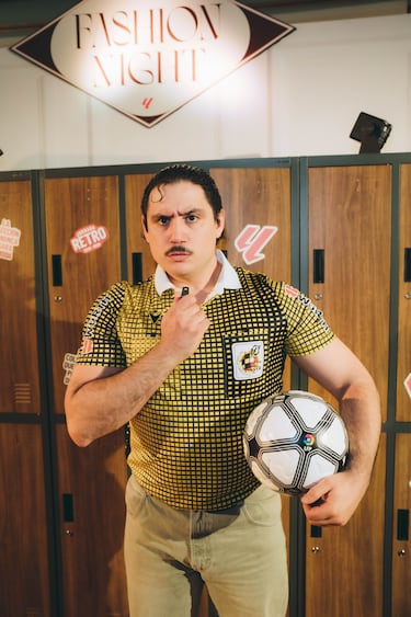
RefereesThe shirt is inspired by the referee kit introduced at the 1994 World Cup in the United States, a moment that marked a turning point in the look of international officiating. That tournament broke away from the traditional “men in black,” introducing vibrant colors and geometric patterns promoted by FIFA and Adidas to improve TV visibility, avoid clashes with dark kits, and make referees easier to identify on the pitch.
The design brings back that iconic aesthetic, also seen in the Copa del Rey final on June 24, 1995—remembered for the historic hailstorm that forced the match to be suspended in the 79th minute at the Santiago Bernabéu—reinterpreting the model with modern manufacturing and the integration of current sponsors to strengthen the link between memory, innovation, and the present.
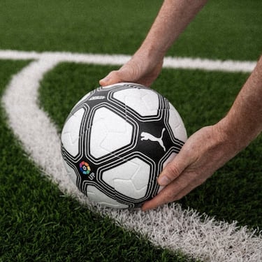
PUMA ballPUMA The ball for LALIGA’s Retro Matchday pays tribute to the aesthetic that defined football in the late 1990s, a time when black-and-white geometric designs became a recognizable symbol of the game. Its graphic revives that iconic style, which accompanied some of the most memorable moments of the era.
This reinterpretation retains the technology of the current official match ball, combining innovation and performance with an image that connects directly with fans’ collective memory. A visual nod to the past that celebrates the history of football through a contemporary lens.

Complete your personal details to comment