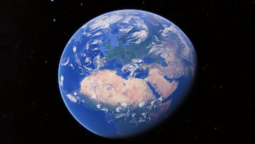
The real size of countries is very different from what is shown on maps
We’ve all used tools like Google Maps often, but how correct is the sizing of every territory in them? Turns out, their true sizes are quite different.

From the classic globe that is in schools—and in many homes—to printed paper maps and applications such as Google Maps. We have all consulted a world map on occasion, whether out of necessity (studies, planning a trip...) or out of mere curiosity, since many people enjoy taking a look at places they dream of visiting.
The maps we consult are like this thanks to the Mercator projection, a type of cartographic projection created by Gerardus Mercator, an expert in mathematics, astronomy, and geography born in 1534. The system, mainly used to prepare nautical charts from the 17th century onwards, tries to represent a spherical surface on a flat one, giving rise to possible distortion that can alter the truth and show different sizes than the existing ones.

The failures of maps in the size of the countries
Related stories
We could say that practically 100% of a world map contains errors, whether significant or imperceptible, so below we mention some the most striking ones.
- Brazil is up to five times larger than Alaska in the real world, but on the maps both areas are similar.
- On maps, Greenland is almost the same size as Africa, but In the real world, Africa is almost 15 times larger.
- Antarctica is always shown on maps as an immense territory, but the truth is that It is the third smallest continent.
- Madagascar is much larger than Britain (about twice as large), but on the maps, they are the same size.
- Ellesmere Island (Canada’s Arctic Archipelago) is 39 times larger than Australia, but on maps...They are equal!
- Russia is a much larger territory on maps than in the real world, the result of excess distortion.
If you want to take a look by yourself, and figure out just how wrong maps can really be due to culture bias and mathematical distortion, we recommend you visit “The True Size of…”. This website allows you to drag and compare countries around an interactive map, and its results are quite surprising.


