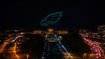
Why do the Philadelphia Eagles wear the color green? What is the origin of their logo?
What’s more American than football? Perhaps, the Bald Eagle. What do you get when you put the two together? The Philadelphia Eagles, a team now one win away from glory.


From its inception in 1933, to what we see today, the NFL team known as the Philadelphia Eagles have only ever used the iconic bird of prey as their logo. Yet, as they’ve gone from last-placed finishes to a Super Bowl winning team, that’s on the verge of repeating the feat, there have been varying changes to that symbol over the years. Let’s take a stroll through them.
The Evolution of the Eagles Logo and Colors
Unlike their upcoming opponents in Super Bowl LVII, the Kansas City Chiefs, the Eagles have seen numerous versions of their logo throughout their history. From the original symbol that was created in 1933, the team has come a long way - color changes and all - to the team we now know today.
Super Bowl LVII - Gumball Style. Who's going to win it this year? @Chiefs or @Eagles
— Gumball Helmet Nation (@Gumball_Helmets) February 10, 2023
Fun fact, from 1963-1973 the arrowhead logo was significantly larger during this period than on the current helmet, and the black outlines around the arrowhead and the letters "KC" were narrower pic.twitter.com/0hRyPiTgVe
1933 – 1935
It only takes a glance at the original Eagles logo design from 1933, to understand that a traditional and detailed approach to the bird itself was taken. What’s even more striking, however, is that it utilized the color blue. Indeed, to this day it remains the only variation of the franchise’s symbol to use blue rather than green.
TIL the original Philadelphia Eagles logo is modeled after the Blue Eagle from the National Recovery Administration (the good NRA), which is part of the New Deal pic.twitter.com/xerAcep9uM
— Charles McGillicutty (@hail_seitan69) September 7, 2018
1936 – 1941
Just three seasons into their life as a professional football team, the Eagles made the first of what would become many changes to their logo. The year was 1936 and the franchise took the decision to revamp the logo. Aside from a general redrawing of the contours of the Eagle, the color palette was also changed from blue to green. Aside from those two major alterations, one can still notice there were other minor changes as well including the angle of the bird, and the ball which was made to be rounder.
1942 – 1947
In what was a rather forward thinking look for its time, the logo was once again re-imagined in 1942. This time, the symbol was given a silhouette and the detail of the design was reduced.
1948 – 1968
Again, there was a subtle but noticeable move towards a more modern look with yet another set of changes in 1948. Aside from a degree of detail which was added, the most significant change was perhaps the use of a slightly different green. The Eagles at the time definitely boasted a logo that looked more realistic than those in the sporting world in general.
1969 – 1972
Perhaps, what could be considered the last of the “old” Eagles designs came in 1969. The color palette was left untouched and the eagles clutching the football were left in place, however, the contours of the logo itself became squares shapes with right angles, which gave it a more contemporary look.
The Philadelphia @Eagles had eight variations of their logo over the years before finally settling on the current backward-facing bird that secretly forms the letter “E”. pic.twitter.com/Kj7yKNofwE
— NFL Football Operations (@NFLFootballOps) February 8, 2023
1973 – 1986
It might just be, that the 1973 alteration is by far the most iconic for Eagles fans. Simplicity seemed to be the order of the day, as the franchise made a handful of small alterations to the helmet design and a legend was born.
1987 – 1995
Related stories
The franchise seemed to return to its roots in 1987, with a redesigned image that definitely paid homage to some of its older iterations during the past. Once again, fans were given the eagles holding a football, while the use of orange and brown appears to add highlights to the design of the birds themselves. Another change, was the direction of the eagles, which now looked left.
1996 – PRESENT
Sometimes all it takes is a fresh start and that is indeed what the Eagles began in 1996. Having been one of the bottom dwellers of the league for many years, the Eagles ushered in a new chapter in the history. Starting with a dramatic change to the team’s look, a completely new logo was created along with a new color palette and a sleeker style. Gone, was the more detailed look of the past and in its place, we now had bold lines and an angry look in the bird’s expression. A change was coming. Today, the logo remains and like the team that wears it, is part of an established history in the game of American Football. The question now is, can they add another page to their story when the face the Chiefs in the Super Bowl on Sunday 12th, February 2023?


